

The F Pattern is a reading pattern commonly observed in online users. When people visit a webpage, they typically scan the content in an F-shaped pattern. Their initial scan covers a horizontal movement across the upper part of the page, forming the top bar of the F. They then proceed to scan down the page in a vertical movement, creating the stem of the F. By understanding this pattern, you can structure your webpages to align with users’ natural reading behavior and capture their attention effectively.
Designing a Clear Hierarchy with Headings
Headings play a crucial role in organizing and structuring your webpage content. By using headings in a hierarchical manner (H1, H2, H3, and H4), you provide a clear visual hierarchy that guides readers through the page. The H1 heading should be the main title of your page, and subsequent headings should be used to break down the content into meaningful sections. This allows users to quickly locate the information they are looking for and encourages them to engage further with your content.
Utilizing Eye-Catching Visuals
Eye-catching visuals are a powerful tool to engage and captivate your website visitors. By incorporating visually appealing elements, you can enhance the overall user experience and effectively convey your message. Here are some strategies for utilizing eye-catching visuals on your webpages:
- High-Quality Images – Use high-resolution images that are relevant to your content. Clear, sharp, and visually stunning images can immediately grab the attention of your visitors and create a positive first impression.
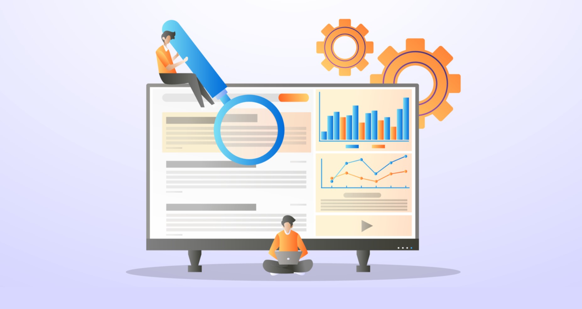
- Infographics – Infographics are a fantastic way to present complex information in a visually appealing and easily digestible format. Use colorful charts, graphs, and illustrations to visually represent data and make it more engaging for your audience.
- Videos – Incorporating videos on your webpages can significantly enhance user engagement. Whether it’s a product demonstration, a tutorial, or a captivating storytelling video, videos can convey your message more effectively and keep visitors hooked to your content.
- Slideshows and Carousels – Slideshows and carousels allow you to showcase multiple images or messages in a dynamic and interactive manner. Use them to highlight different features, products, or key points, keeping your visitors visually engaged and interested.
- Icons and Illustrations – Icons and illustrations can add a touch of creativity and uniqueness to your webpages. They help break the monotony of text and make your content more visually appealing. Choose icons and illustrations that align with your brand and effectively communicate your message.
- Color Scheme – Select a visually pleasing color scheme that resonates with your brand identity and enhances the overall aesthetic appeal of your webpages. Use contrasting colors strategically to draw attention to important elements and create a visually balanced composition.
- Call-to-Action Buttons – Design visually striking and attractive call-to-action buttons that stand out from the rest of your content. Use contrasting colors, engaging typography, and appealing visuals to make your buttons irresistible to click.
- User-Generated Content – Incorporating user-generated content, such as customer reviews, testimonials, or social media posts, can add authenticity and credibility to your webpages. Displaying real-life visuals and experiences of your customers can be highly persuasive and engaging for new visitors.
- Animated Elements – Consider adding subtle animations or interactive elements to your webpages. Animated elements can draw attention, provide visual interest, and create a memorable browsing experience for your visitors.
- Negative Space – Don’t forget the importance of negative space or whitespace. A clean and well-balanced layout allows your visuals to stand out and breathe. It also improves readability and creates a visually pleasing composition.
Remember, the key to utilizing eye-catching visuals effectively is to ensure that they align with your brand, enhance your message, and create a visually cohesive and engaging experience for your visitors. Experiment with different visual elements, analyze their impact on user engagement, and continuously optimize your visuals to achieve the maximum desired effect.
Placing Important Information Strategically
To maximize the impact of your webpages, it is vital to place important information strategically. Based on the F Pattern, users tend to focus more on the top and left side of the page. Therefore, critical information, such as key benefits, unique selling propositions, or important statistics, should be placed within these areas to capture users’ attention and deliver your message effectively.
Crafting Compelling Call-to-Actions
A well-crafted call-to-action (CTA) is essential for guiding users towards the desired action on your webpage. Whether it’s making a purchase, signing up for a newsletter, or contacting your business, a compelling CTA can significantly increase conversion rates. Place your CTAs strategically within the F Pattern, making them visually prominent and using persuasive language that encourages users to take action.
Implementing Responsive Design for Mobile Users
In today’s mobile-centric world, it is crucial to ensure that your website provides an optimal user experience across different devices and screen sizes. Implementing responsive design is the key to achieving this goal. By utilizing responsive design techniques, you can create a website that automatically adjusts and adapts its layout, content, and functionality to suit the specific needs of mobile users.
Here are some essential considerations when implementing responsive design for mobile users:
|
Aspect |
Description |
|
Mobile-Friendly Layout |
Design a layout that works well on smaller screens without compromising usability. Use a single-column or stacked layout, which allows content to flow vertically and eliminates the need for horizontal scrolling. Ensure that navigation menus, buttons, and other interactive elements are easily tappable and accessible on touchscreens. |
|
Fluid Grids |
Implement fluid grids that enable your website to resize and reorganize content based on screen width. Instead of fixed pixel-based measurements, use relative units such as percentages or ems to create flexible and scalable layouts. This allows content to adjust proportionally, ensuring a consistent and harmonious experience across devices. |
|
Media Queries |
Employ media queries to apply specific CSS rules based on different screen sizes or device characteristics. Media queries allow you to target specific breakpoints and customize the layout and styling accordingly. By using CSS media queries, you can hide, show, or modify elements to optimize the display for various devices. |
|
Flexible Images |
Optimize images for responsive design by using the appropriate image formats and sizes. Serve different image resolutions based on the device’s pixel density to ensure fast loading times and sharp visuals. Additionally, use CSS properties like max-width – 100% to make images resize proportionally and fit within their container without overflowing. |
|
Touch-Friendly Interactions |
Consider the touch interface when designing interactions and user interfaces for mobile devices. Ensure that buttons, links, and other interactive elements have adequate spacing to prevent accidental taps. Incorporate swipe gestures and touch-based interactions where appropriate to enhance the mobile user experience. |
|
Content Prioritization |
Prioritize and streamline content for mobile users. Identify the most important and relevant information and ensure it is prominently displayed on smaller screens. Minimize or reorganize less critical content to maintain a clean and focused interface. Use collapsible sections or accordions to present additional information, allowing users to expand and access it when needed. |
|
Performance Optimization |
Optimize the performance of your responsive website to ensure fast loading times on mobile devices. Compress and minify CSS, JavaScript, and HTML files. Use lazy loading for images and videos to defer their loading until they become visible on the screen. Minimize the number of HTTP requests and leverage browser caching to improve overall performance. |
|
Cross-Browser Compatibility |
Test your responsive design across different browsers and devices to ensure consistent behavior and appearance. Be aware of browser-specific quirks and limitations and make necessary adjustments to ensure a seamless experience for all users. Use browser testing tools and emulators to identify and fix any compatibility issues. |
By implementing responsive design techniques, you can create a website that delivers an optimal user experience on mobile devices. Remember to test your responsive design thoroughly, gather user feedback, and make iterative improvements to provide the best possible experience for your mobile users.
Optimizing Page Loading Speed
Page loading speed is a critical factor that directly impacts user experience and website performance. Slow-loading webpages not only frustrate users but also negatively affect search engine rankings. To ensure a fast and efficient browsing experience, it is essential to optimize the loading speed of your webpages. Here are some effective strategies for optimizing page loading speed:
- Compress Images – Large image files can significantly slow down page loading times. Compress and optimize images without compromising quality using tools like Photoshop, Squoosh, or online image compressors. Use appropriate file formats such as JPEG for photographs and PNG for graphics with transparency.
- Minify CSS and JavaScript – Minifying CSS and JavaScript files involves removing unnecessary characters like whitespace, comments, and unused code. This reduces file sizes and improves loading speed. Use minification tools or plugins to automatically minify your CSS and JavaScript files.
- Enable Browser Caching – Leverage browser caching to store static resources, such as images, CSS, and JavaScript files, on visitors’ browsers. This allows returning visitors to load your website faster by retrieving cached files instead of downloading them again. Set an appropriate expiration time for caching to balance freshness and performance.
- Reduce HTTP Requests – Each resource on your webpage, including images, scripts, and stylesheets, requires a separate HTTP request. Minimize the number of requests by combining and consolidating files whenever possible. Use CSS sprites to combine multiple images into a single file, and consider using asynchronous or deferred loading for JavaScript files.
- Utilize Content Delivery Networks (CDNs) – CDNs are distributed networks of servers that store cached copies of your website’s static files. By delivering content from servers located closer to the user’s location, CDNs reduce the distance and time required to transmit data, resulting in faster loading speeds. Consider using a reputable CDN service to serve your static files.
- Optimize Code and Database Queries – Optimize your website’s code and database queries to reduce execution time. Remove unnecessary code, optimize database queries with indexes, and use efficient coding practices. Consider implementing object caching or database query caching to minimize the need for repeated database calls.
- Implement Lazy Loading – Lazy loading is a technique where images or other media are loaded only when they become visible on the user’s screen. This prevents unnecessary loading of off-screen content and significantly improves initial page loading speed. Use lazy loading plugins or libraries to implement this technique easily.
- Enable Gzip Compression – Gzip is a compression method that reduces the size of your website’s files before they are sent over the network. Enable Gzip compression on your server to compress your HTML, CSS, JavaScript, and other text-based files. This reduces file sizes, resulting in faster downloads and improved loading times.
- Minimize Redirects – Excessive redirects can increase page loading times, as each redirect adds an additional round trip to the server. Review your website’s redirects and eliminate unnecessary or redundant redirects. Ensure that your website uses efficient and minimal redirects when they are required.
- Optimize Web Fonts – Web fonts can significantly impact loading speed. Minimize the number of web fonts used on your website and consider using system fonts or preloading techniques to expedite the rendering process. Use font formats like WOFF2, which offer better compression and faster loading times.
- Monitor and Analyze – Regularly monitor your website’s loading speed using tools like Google PageSpeed Insights, GTmetrix, or Pingdom. These tools provide detailed insights and recommendations for improving loading times. Analyze the results and make necessary optimizations based on the performance data.
By implementing these strategies, you can significantly improve the loading speed of your webpages, resulting in a better user experience, increased engagement, and improved search engine rankings. Remember that ongoing monitoring and optimization are essential to maintain optimal loading speeds as your website evolves and grows.
Incorporating Engaging and Scannable Content
When it comes to creating effective webpages, incorporating engaging and scannable content is key to capturing and retaining the attention of your audience. Engaging content ensures that visitors stay on your webpage longer and are more likely to explore further. Scannable content, on the other hand, makes it easy for users to quickly grasp the main points and find the information they need. Here are three essential aspects to consider when incorporating engaging and scannable content –
- Informative and Conversational Tone – Engaging content speaks directly to the reader in a conversational tone. It should feel like a friendly conversation rather than a formal document. Use an informal style, personal pronouns, and a tone that resonates with your target audience. By creating content that feels relatable and approachable, you can better connect with your readers and keep them engaged.
- Clear and Concise Paragraphs – Break up your content into clear and concise paragraphs that are visually appealing and easy to scan. Lengthy paragraphs can overwhelm readers, leading to a higher likelihood of them leaving your page. Aim for paragraphs that consist of two to four sentences, making the content more digestible. Use subheadings to introduce new sections and guide readers through your content.
- Visual Elements and Formatting – Incorporate visual elements such as images, videos, infographics, and bullet points to enhance the visual appeal of your content. Visuals can help break up text-heavy sections and provide a visual representation of your message. Use formatting techniques like bolding, italics, and highlighting to draw attention to important points and make your content scannable. Utilize whitespace strategically to create a sense of visual clarity and improve readability.
By implementing these strategies, you can create engaging and scannable content that captures the interest of your audience and encourages them to stay on your webpage. Remember to adapt your content to the preferences and needs of your target audience, keeping it concise, informative, and visually appealing.